Hello!
One of my favorite Bitcoiners (PlanB) twitter handle: @100trillionUSD posted an updated chart of their model, the Stock to flow model. Also known as S2F. I recommend you to follow him for alpha information. His analysis helped me during all my journey.
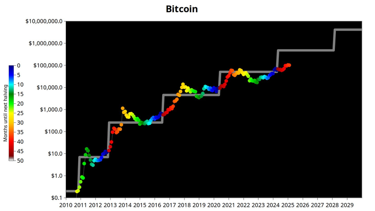
This is the chart:
What do you see in this chart?
Well, the grey lines are the projected Bitcoin price by the Stock to Flow model. As you can see there are sharp increases in price that occur after the halvings. This model is very interesting because has been predicting the Bitcoin price very accurately since the inception. It's one of my favorite models!
I usually take a look at their updates because I find the information in this chart very valuable.
You can also notice that in the other cycles we raised earlier, the orange dots are usually a lot higher, and they are even in the grey line. In the first 2 cycles we have the yellow color above the grey line. We are actually entering the orange color zone, and after that we will be in the yellow zone.
In the past, when we got to the yellow color it was the top. This time is going to follow the same pattern? I think so.
For that reason, I expect some bullish months before a huge correction. At the end of the day, humans are drived by emotions. Fear and Greed are the ones that move the market.
Take care!
Posted Using INLEO