Happy 4th of July weekend, everyone!
I had intended to get a post out yesterday but got completely sidetracked working on a new feature. Over the last couple of days, I've been reminded of a fundamental truth in the developer world: data visualization sucks. A lot.
But after a long and hard-fought battle with charts and data points, I'm excited to announce a new update to the RC Claims and Account Tool.
The tool now features a historical chart to help you visualize the RC cost of claiming an account creation token over time. The big new addition is that you can now toggle between a 24-hour, 7-day, or a full 30-day monthly view to get a better sense of the trends.
Here's a look at the new monthly view in action:
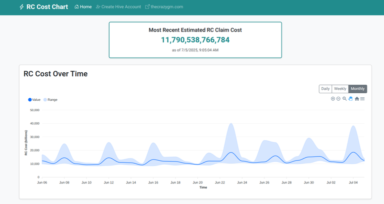
Part of the reason this update was such a struggle was that the original charting library I was using wasn't flexible enough for what I wanted to achieve. This "simple" update ended up requiring me to rip out the old library completely and replace it with a new one (ApexCharts), which ultimately provides a much better and more interactive experience.
Despite the frustration, I'm really happy with how it turned out, and I hope this new visualization gives everyone better insight into how RC costs fluctuate over time.
You can check out the live tool and the code at the links below.
- Live Site: https://rc.thecrazygm.com
- GitHub Repo: https://github.com/TheCrazyGM/claimr
Enjoy the rest of the long weekend!
As always,
Michael Garcia a.k.a. TheCrazyGM