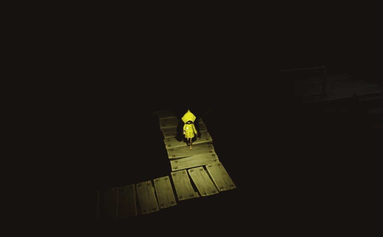
Hello, people of the Internet. Today I want to write for the first time in this community and I want to start by showing the beauty of one of my favourite games.
Among other aspects, Litle Nightmares is very famous for its artwork and cinematography (cinematically speaking for lack of a better word) so since it's a video game photography community, that's what I want to highlight from some screenshots I took while playing, according to aspects of it that caught my attention.
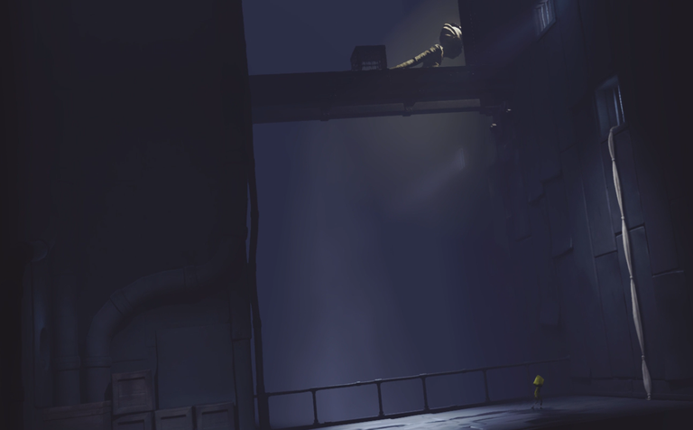
This photograph for example, has a perfect balance between light and shadow (the game is famous for this, for its good use of these elements) in the photograph we can observe an inclined plane (which helps to generate strangeness or discomfort) and two elements stand out in it, one is Six (our protagonist) due to the yellow poncho she is wearing which contrasts with the rest of the colour palette which is generally quite neutral (a balance of cold colours prioritising bluish grey and black) and the halo of golden light that ends up highlighting one of our antagonists in a quite theatrical way as it is the first introduction to what is to come, a taste of what you are going to face.
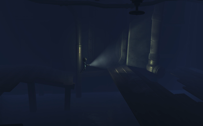
Continuing with the DLC of the same game, once again in this picture he shows off his good implementation of light and shadow, you can appreciate all the details such as the fog reflected in the light of the lantern.
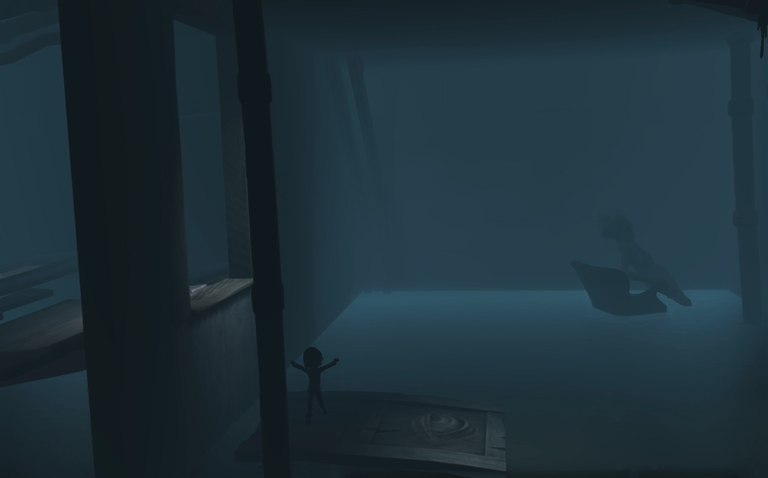
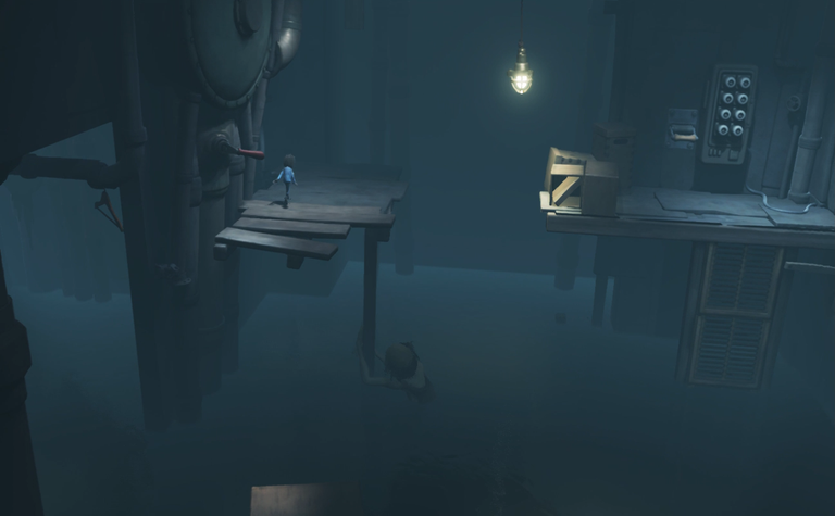
In these two photos we have a picado shot and in the second one, a detail in thirds of blur and in the background we can appreciate the out-of-focus silhouette of a terrifying figure (our antagonist) in fact in the second photo it can be appreciated very well and in effect it is quite chilling.
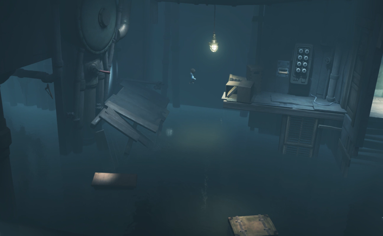
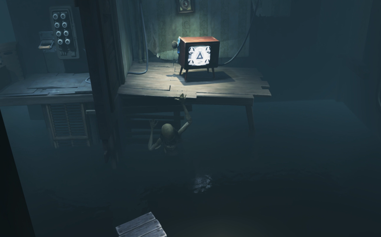
The lighting again plays an important role, the spotlights are perfectly placed so that you can see what is happening without losing the ambience and tension in the handling of the horror. The sharp shots help not only to give focus and presence to the antagonist (who is walking or swimming through the water) but also to generate an oppressive feeling in general.
And as well as these shots or photographs there are many more in general that would deserve a new post because of the beauty of their composition.
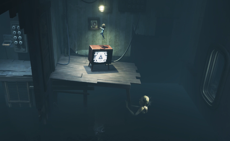
And well, people, that's all for today's post, I hope you liked it. Thank you very much as always for supporting my work, I welcome new readers, I love you all very much, I send you a hug and I'll see you in another post.
I made the cover and farewell image in Canva