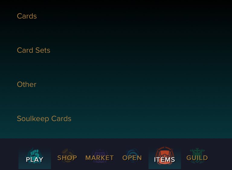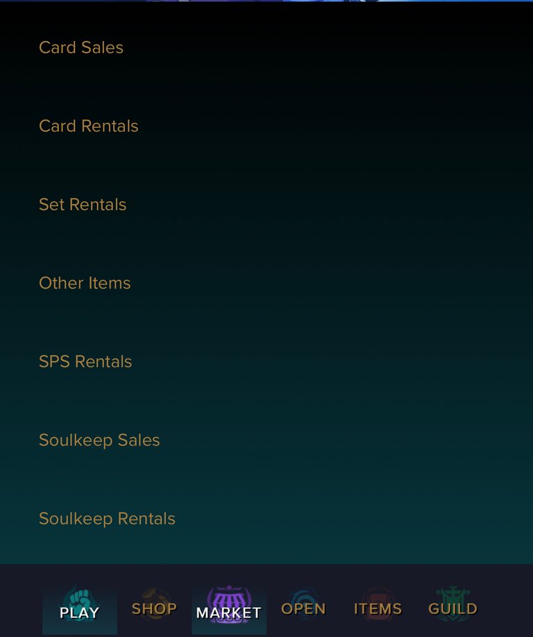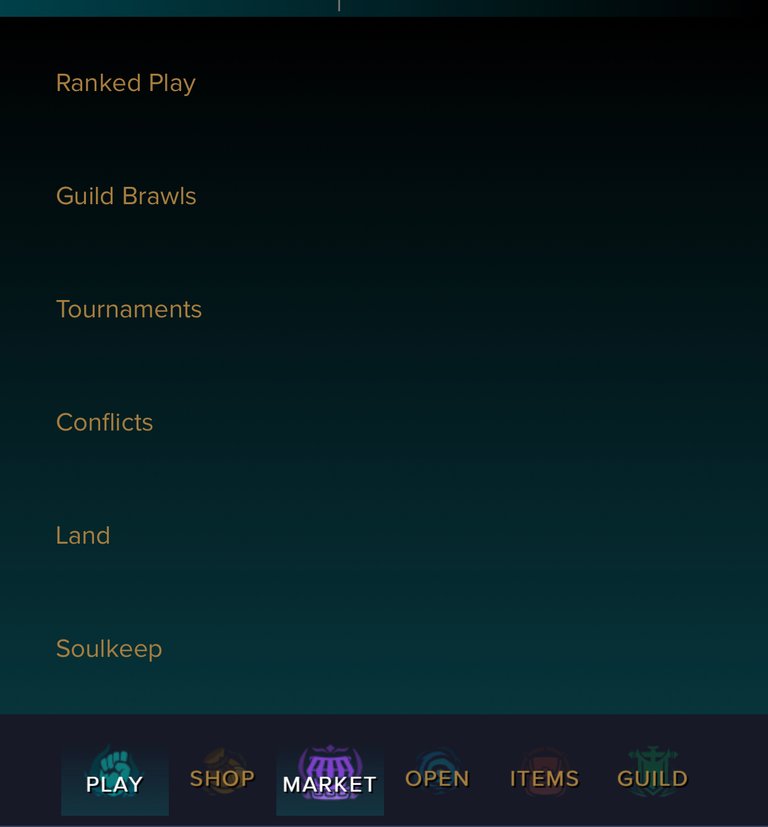
My first impression of the updated text and links in game is a solid two thumbs up. I like how the texts works well into the background and how it makes it seem less. The whole feel of it is like modernized.


The updated links are easier to see and appears more organized than the old setup. Menu rising up makes it faster to flip through the links versus the carrot drop down menu.
The pages seem to load better too on mobile. The biggest headache I had from the old version was the front page background being a short clip animation. Almost every time I get to the front page the short clip automatically runs and pulls me out of the battle page. It’s time consuming to either watch the clip or exit out of it. I had to do this almost 99% of the time I got on to homepage. Now none of this with this refresh GUI.
It also appears the value of in fame assets are rising in price which is generating more positivity for the game as a whole. Things are looking up.
Until next time thanks for reading!!!

I have plenty of other cards for rent! Just go on peakmonsters and check out the market place and if you are curious what I offer here is a link:
If You have yet to take part in playing this great game called Splinterlands please click on my referral link. It is free but in order to earn real assets such as cards and token you would have to invest in a starter deck or purchase game cards. Join the discord to learn more. Good luck!

THANKS FOR READING! CONTINUE TO PLAY SPLINTERLANDS!


