You are viewing a single comment's thread from:

RE: Snaps Container // 1747169280

in Snaps7 months ago

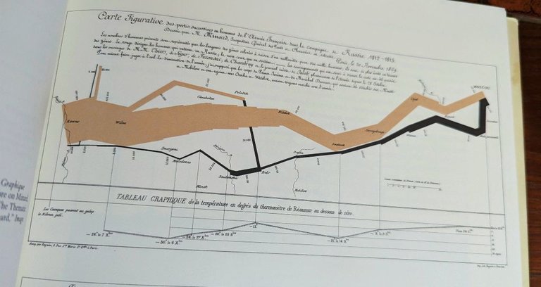
This graphic by Charles Minard shows Napoleon’s army advance into Russia (thick brown band) and their retreat (thin black band). The width of the band represents the size of the army as it advances (left to right) and retreats (right to left). Temperatures are also shown.

Napoleon Infographic.jpg

Sort:  

What kind of math is that!

Napoleon's army famously marched into Russia and was essentially destroyed. So the graphical map shows the size of the army marching in and out of Russia. Notice how the bands get thinner. That means the soldiers were dying. So the graphic tries to visually simplify this event.

The reproduction of this infographic is found in Edward Tufte's The Visual Display of Quantitative Information